While you cannot add new measures to an OLAP report
without returning to the original report request, you can adjust
the display of the measures in the report in several ways. You can:
When you have more than one
measure in an OLAP report, you can stack the measures in separate
rows within the same column to reduce the width of the report.
You cannot apply data visualization bar
graphs to stacked measures.
Procedure: How to Display Stacked Measures
-
Open
the Control Panel.
-
Select
the Stack Measures check pane to display
measures in separate rows under one column.
-
Click Run to
execute your report.
Tip: To
restore the standard display, deselect the Stack Measures check
pane and rerun the report.
Example: Displaying Stacked Measures
The
following is an example of displaying stacked measures.
- Run the Standard
Report OLAPREP4.
Initially,
this report is sorted vertically by Continent and Risk_Class and
horizontally by Region, and the measures—Balance and CANADA_DOLLARS—appear
as separate columns.
- For this example,
you will not need the Region dimension, but you will need the Country
dimension. You can quickly make these changes to the report:
- Right-click Region and
select Delete from the menu.
- Right-click Continent and
select Unhide from the menu, then select Country from
the secondary menu.
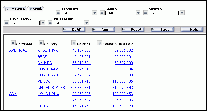
The report now displays data by Continent
followed by Country as shown in the following image.
You
wish to show the measure titles and data values in rows.
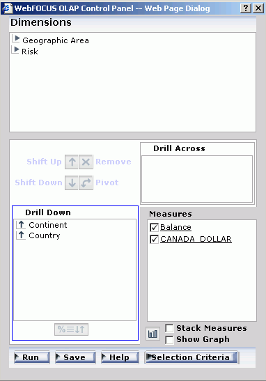
- Click the OLAP button
on the band below the Selections pane to open the Control Panel.
- Click the Stack
Measures check pane below the Measures pane as shown
in the following image.
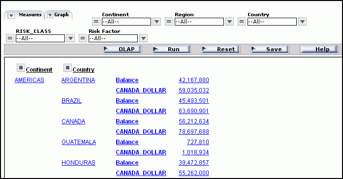
- Click Run to
execute the report and display the titles and values of the measures
stacked over each other in separate rows as shown in the following
image.
Changing the Order of Measure Columns
You can change the order in which measure columns are
presented in the report.
Procedure: How to Reposition Measure Columns in an OLAP Report
To
reposition a numeric column, drag and drop the field into a new
column position.
The cursor changes to a plus (+) sign to
indicate acceptable places into which you can drop the field. (Unacceptable
positions are indicated by a circle with a slash cross the center.)
Example: Repositioning Measure Columns
The
following is an example of repositioning measure columns.
- Run the Standard
Report OLAPREP2.
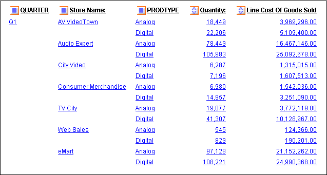
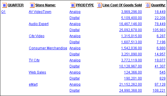
As
shown in this image, the column for the Quantity measure precedes
the column for the Line Cost of Goods Sold measure.
- To change the
order of columns, drag and drop Line Costs of Goods Sold before Quantity.
The
cursor changes to a + sign to designate where you can drop the field.
The report, as shown in the following image, now displays the Quantity
column as its last column.
Hiding and Displaying Measures
You can hide and expose measures from an OLAP report,
the Selections pane, or the Control Panel.
Procedure: How to Hide or Expose a Measure From the Report
To hide a measure column, right-click
the column title and choose Hide from the
menu. The column is automatically removed from the display.
To expose a hidden measure column, right-click
a displayed measure and choose Unhide from
the menu. A secondary menu lists any hidden measures.
Choose
the one you want to re-expose in the report.
Tip: If
you want to add a new measure to the report, you must return to
the original request and add the field there.
Example: Hiding and Exposing a Measure From the Report
The
following is an example of hiding and exposing a measure from the
report.
- Run the Standard
Report OLAPREP2.
The
report includes two measures: Quantity and Line Cost of Goods Sold.
- Right-click
the Line Cost of Goods Sold and choose Hide from
the menu as shown in the following image.
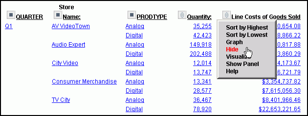
Note: The options available may
vary, depending on your OLAP format settings. For more information,
see Setting OLAP Reporting Options.
The report runs and displays
only the Quantity measure.
- Right-click Quantity and
select Unhide.
A secondary menu displays
the hidden measure.
- Select LINE_COGS to
redisplay Line Cost of Goods Sold as shown in the following image.
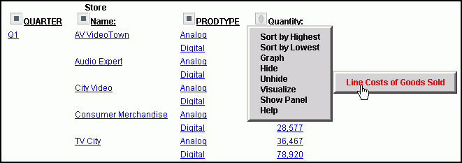
Note: The options available may
vary, depending on your OLAP format settings. For more information,
see Setting OLAP Reporting Options.
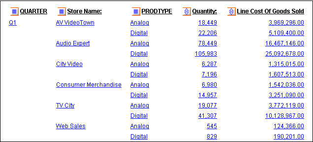
The report now displays the
Line Cost of Goods Sold column as shown in the following image.
Procedure: How to Hide or Display a Measure From the Selections Pane
-
Click
the down arrow to the left of the Measures control to display a
list of the measures in the report.
-
Click
the check pane next to a measure to display or hide it. The check pane
toggles through three positions.
-
To hide the measure, click
the check pane until it is blank.
-
To expose a hidden measure, click
the check pane until you see a check mark.
Tip: You
can use the same check pane to display a column of data visualization
bar graphs for numeric measures. This setting is represented as
a graph in the check pane. For details, see Visualizing Trends.
Example: Hiding and Exposing a Measure Column From the Selections Pane
The
following is an example of hiding and exposing a measure column
from the Selections pane.
- Run the Standard
Report OLAPREP2.
Because
of the OLAP settings selected for this report, the Selections pane
is hidden. For this example, you will need to expose it.
- Right-click QUARTER and
select Show Panel from the menu.
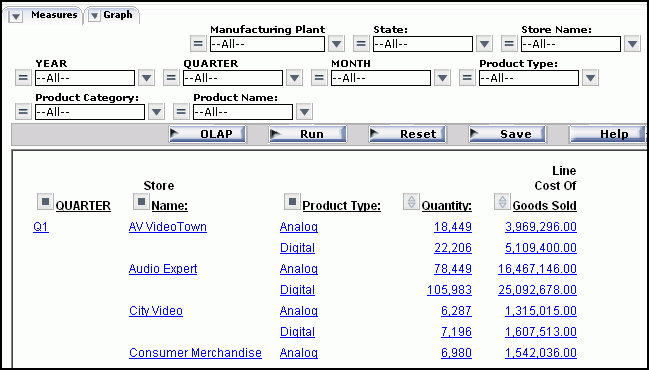
As shown
in the following image, the report now looks like this: two measures—Quantity
and Line Cost of Goods Sold—appear.
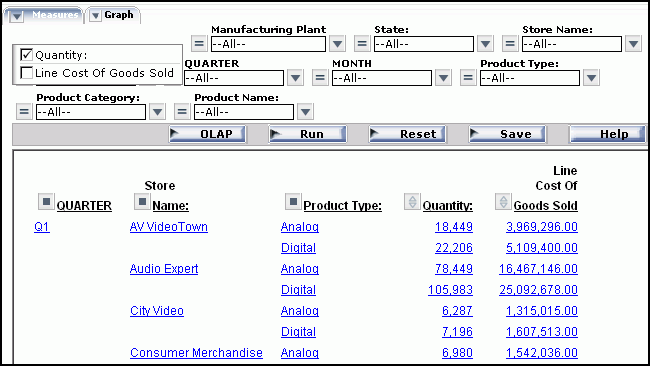
- In the Selection
pane, click the arrow to the left of the Measures control to list
the measures in the report. Notice that both measures are checked.
- To hide Line
Cost of Goods Sold, click the check panel until it is
blank as shown in the following image.
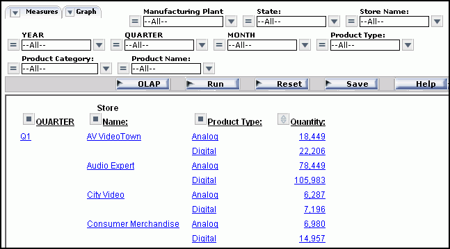
- Click the Run button
on the band below the Selections pane.
Only Quantity now
appears as shown in the following image.
- Open the Measures
control again and recheck Line Cost of Goods Sold as
shown in the following image.
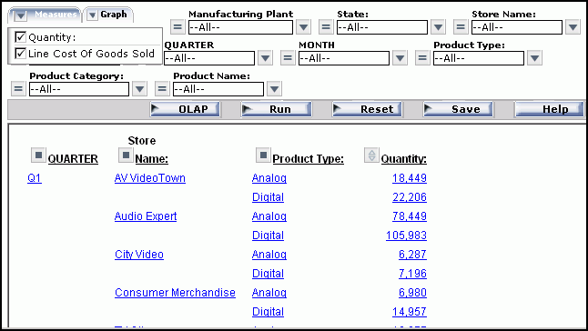
- Run the report
again.
The output now looks as it originally did.
Procedure: How to Display or Hide a Measure From the Control Panel
-
Open
the Control Panel.
-
In the
Measures pane, click the check pane next to a measure to display
or hide it. The check pane toggles through three positions.
-
To hide the measure, click
the check pane until it is blank.
-
To expose a hidden measure, click
the check pane until you see a check mark.
Tip: You
can use the same check pane to display a column of data visualization
bar graphs for numeric measures. This setting is represented as
a graph in the check pane. For details, see Visualizing Trends.
-
Click Run to
execute your report.