WebFOCUS
Online Help > Managed Reporting Developer > Creating Graphs With Advanced Graph Assistant > Applying Custom Styling to a Graph
Applying Custom Styling to a Graph
While using Advanced Graph Assistant,
you can customize your graph using the Chart Properties form, the
Field Properties form, and the various chart editing forms of the
Chart Editor. The customizations you can apply to your graph include customizing
fonts, colors, scales, data labels, titles, frame attributes, 3D
effects, graph size, axis placement (graph orientation), text display,
legend location, template selection and more. For more information
about using the Chart Editor, see Modifying Graph Properties With Chart Editing Forms.
Applying Predefined Color Scheme Templates
Advanced Graph Assistant offers a variety of predefined
color scheme templates you can select from either the Chart Type
editing form when selecting a chart type, or the Quick Chart editing
form when using the Chart Editor. You can select to apply any of
the available color scheme templates to change the appearance of
your graph. A complete list of available color scheme templates
is shown in the following table:
|
Available Color Scheme Templates
|
|---|
|
Southwestern
|
Pastels
|
|
Extruded Pastels
|
Cylinders on gray
|
|
Plum on white
|
Greys
|
|
Fade to gray
|
True Colors
|
|
Color to white
|
Red Accent
|
|
Beveled on tan
|
Default
|
Procedure: How to Apply a Color Scheme Template from the Chart Type Tab
-
Click
the Chart type tab.
-
Select
a chart type.
The chart type editing form for the selected chart type
appears below the graph preview area.
-
Click
the Value column area to the right of Apply template in the Property column.
A drop-down arrow appears at the far right edge of the
row in the Value column.
-
Click
the down-arrow to open the drop-down list.
-
Select
one of the available color scheme templates. For a complete list, see Applying Predefined Color Scheme Templates.
The color scheme template you selected appears in the graph
preview area.
Procedure: How to Apply a Color Scheme Template from the Chart Editor Tab
-
Click
the Chart editor tab.
-
In the
Chart folder, click the Quick chart form.
The Quick chart editing form appears below the graph preview area.
-
Click
the Value column area to the right of Apply template in the Property column.
A drop-down arrow appears at the far right edge of the
row in the Value column.
-
Click
the down-arrow to open the drop-down list.
-
Select
one of the available color scheme templates. For a complete list, see Applying Predefined Color Scheme Templates.
The color scheme template you selected appears in the graph
preview area.
Procedure: How to Create and Apply a Custom Graph Template
Custom
graph templates are useful when you want complete control over the
appearance of a chart. When creating charts, you can utilize custom templates
by creating and adding them to the built-in templates that are standard
in Advanced Graph Assistant. Custom graph templates can be created,
saved, and stored for future use by doing the following steps:
-
Create
and edit a chart to the desired customized appearance.
-
Save
the graph procedure and exit Advanced Graph Assistant.
-
Open
the graph procedure (that you saved in step 2) with the Text Editor.
-
Copy
all of the formatting (Graph API) calls, located in the GRAPHSTYLE section
of the procedure, to a text file using Notepad or a similar tool.
Note: If you have in-depth knowledge of Graph API
calls, you can manual code a custom template in a text file.
-
Save
the text file as templatename.txt in the following template directory
(where templatename is a descriptive name for the new template):
drive:\ibi\WebFOCUS76\ibi_html\javaassist\images\tdg\template
-
Verify
the new custom template you created is in the tool by opening Advanced
Graph Assistant and performing the following:
-
Select a chart type, which displays the chart type editing
form for the selected chart type below the graph preview area.
-
Click the Value column area to the right of
Apply template in the Property column.
-
Click the down-arrow at the far right edge of the row in the
Value column.
-
Use the drop-down list to select the name of the new custom template
you created.
-
Verify the appearance of the new template as it appears in
the graph preview area.
Note:
Customizing Fonts in a Graph
You can change the fonts for data, data labels, series
data, X- and Y-axis labels, legend text, titles (title, subtitle,
footnote), and annotations. Use the appropriate chart editing form
in the Chart editor tab to customize the fonts used in your graph.
For a list of all chart editing forms, see Chart Editor Folders and Forms. Depending on the chart editing form, your
options for customizing fonts include all or a subset of the following:
-
Font name. Select
the font type. For a complete list of available fonts, see Font Types Available. Depending on the fonts installed on your machine,
some fonts may not be distinguishable from others.
-
Font size. Set
the numeric font size.
-
Font style. Select
from Plain, Italic, Bold, Italic Bold, Underline, Italic Underline,
Bold Underline, or Bold Italic Underline.
-
Text justification. Select
from Left, Center, or Right horizontal justification.
-
Text rotation. Select
from None, 45 degrees (diagonal), 90 degrees (vertical - top to
bottom), or 270 degrees (vertical - bottom to top).
-
Text strike through. Select
True or False to turn the strike through affect on or off.
-
Text underline type. Select
from 1 Pixel, 2 Pixels, Dotted, Gray, or Dashed.
-
Text wrap. Select
True or False to turn text wrapping on or off.
-
Fill Color. Select
the font color.
Procedure: How to Edit X-axis, Y-axis, and Legend Label Fonts
-
Click the Chart editor tab.
-
Use the appropriate Labels form to
edit fonts and other related properties.
- To change X-axis label fonts, click
the Labels form in the Ordinal axis folder.
- To change Y-axis label fonts, click
the Labels form in the Y1 axis folder.
- To change legend fonts, click the Labels
form in the Legend folder.
-
You
can change any of the following font attributes in the Labels form. To
change the:
- Font name, click
the Value column in the row that displays Font name in the Property
column.
Click the drop-down arrow that appears at the far right
edge of the row in the Value column, then select the desired font
name from the list.
- Font size, double-click
the Value column in the row that displays Font size in the Property
column, then edit the font size number.
- Font style,
click the Value column in the row that displays Font style in the Property
column.
Click the drop-down arrow that appears at the far right
edge of the row in the Value column, then select the desired font
style from the list.
- Text justification,
click the Value column in the row that displays Text justification
in the Property column.
Click the drop-down arrow that appears
at the far right edge of the row in the Value column, then select
the desired type of text justification from the list.
- Text rotation,
click the Value column in the row that displays Text rotation in the
Property column.
Click the drop-down arrow that appears at the
far right edge of the row in the Value column, then select the desired
degree of text rotation from the list.
-
If you
changed the font size, you have to turn the automatic resizing feature
off to make the change to the font size effective.
In the Labels chart editing form,
click the Value column in the row that displays Automatic resizing
in the Property column. A drop-down arrow appears at the right edge
of the row in the Value column. Click the down arrow, then select No.
Note: There are additional
font attributes you can try that are not listed above, for example,
underline style.
Procedure: How to Edit Title, Subtitle, and Footnote Fonts
-
Click
the Chart editor tab.
-
Use the appropriate form to edit fonts
and other related properties.
- To change chart title fonts, click the Title form
in the Titles folder.
- To change chart subtitle fonts, click
the Subtitle form in the Titles folder.
- To change chart
footnote fonts, click the Footnote form in
the Titles folder.
-
You
can change any of the following font attributes. To change the:
- Font name, click
the Value column in the row that displays Font name in the Property
column.
Click the drop-down arrow that appears at the far right
edge of the row in the Value column, then select the desired font
name from the list.
- Font size, double-click
the Value column in the row that displays Font size in the Property
column, then edit the font size number.
- Font style,
click the Value column in the row that displays Font style in the Property
column.
Click the drop-down arrow that appears at the far right
edge of the row in the Value column, then select the desired font
style from the list.
- Text justification,
click the Value column in the row that displays Text justification
in the Property column.
Click the drop-down arrow that appears
at the far right edge of the row in the Value column, then select
the desired type of text justification from the list.
- Text rotation,
click the Value column in the row that displays Text rotation in the
Property column.
Click the drop-down arrow that appears at the
far right edge of the row in the Value column, then select the desired
degree of text rotation from the list.
-
If you changed the font size, you have
to turn the automatic resizing feature off to make the change to
the font size effective.
In the
Title, Subtitle, or Footnote chart editing form, click the Value
column in the row that displays Auto resize in the Property column.
A drop-down arrow appears at the far right edge of the row in the
Value column.
Click the down-arrow
to open the drop-down list, then select No.
Note: There
are additional font attributes you can experiment with that are
not listed above, for example, underline style.
Reference: Font Types Available
The
following font types are available in Advanced Graph Assistant.
|
Font Type Names
|
|---|
|
Arial
|
Arial Black
|
Arial Narrow
|
Book Antigua
|
|
Bookman Old Style
|
Bookshelf symbol 7
|
Century Gothic
|
Comic Sans MS
|
|
Courier New
|
Default
|
Dialog
|
Dialog Input
|
|
Garamond
|
Georgia
|
Heattenschweiler
|
Impact
|
|
Lucida Bright
|
Lucida Console
|
Lucida Handwriting
|
Lucida Sans
|
|
Lucida Sans Typewriter
|
Lucida Sans Unicode
|
Mariett
|
Microsoft Sans Serif
|
|
Monospaced
|
Monotype Corsiva
|
MS Outlook
|
MS Reference Sans Serif
|
|
MS Reference Specialty
|
Palatino Linotype
|
Sans serif
|
Serif
|
|
Symbol
|
Tahoma
|
Times New Roman
|
Trebuchet MS
|
|
Verdana
|
Webdings
|
Wingdings
|
Wingdings 2
|
|
Wingdings 3
|
ZWAdobeF
|
|
|
Applying Line Stroke Styles to Line Objects
You can apply line stroke styles to line objects in
the Chart Editor of Advanced Graph Assistant. Line objects make
up the various lines and grids of a graph, which include, but are
not limited to, X-axis Major and Minor gridlines, Y-axis Major and
Minor gridlines, and Y-axis Reference lines. Line stroke styles
can be used to change the appearance of your graph, and are supported
in PNG, JPEG, and GIF formats.
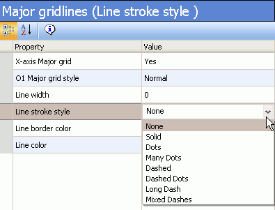
The available line stroke style options, shown in the following
image, are None, Solid, Dots, Many Dots, Dashed, Dashed Dots, Long
Dash, and Mixed Dashes.
Procedure: How to Apply Line Stroke Styles to Line Objects
-
Click
the Chart editor tab.
-
You
can apply line stroke styles to X-axis and Y-axis line objects:
-
For X-axis line objects, select the Major gridlines or Minor
gridlines form in the Ordinal axis folder.
-
For Y-axis line objects, select the Major gridlines, Minor
gridlines, or Reference lines form
in the Y1 axis folder.
The selected chart editing form appears below the graph
preview area.
-
Click
the Value column area to the right of line stroke style in the Property
column.
A drop-down arrow appears at the far right edge of the row
in the Value column.
-
Click
the down arrow to open the drop-down list.
-
Select
one of the available line stroke styles.
That style appears for the selected line object in the graph
preview area.
Setting the Graph Height and Width
The
width (or horizontal axis) of each graph, which includes any surrounding
text, is automatically set to 770 pixels. When setting the graph
width, you should allow for the inclusion of any text required for
the vertical axis and its labels along the left margin.
The height (or vertical axis) of your graph is automatically
set to 405 pixels.
The vertical axis is automatically set to cover the total range
of plotted values. The height of the axis is set as high as possible
(taking into consideration the presence of any headings or footings
and the need to provide suitably rounded vertical class markers).
The range is divided into intervals called "classes." The scale
is normalized to provide class values rounded to the appropriate
multiples and powers of 10 for the intervals plotted on the axis.
Procedure: How to Edit the Graph Height and Width
-
Click
the Data Selection tab.
-
Click
the Chart
 icon
in the query pane below the Available Fields tab.
or
Click anywhere on the chart displayed in the graph
preview area.
The Chart Properties form is displayed below
the graph preview area.
-
Click
the Value column to the right of the Custom Height or Custom Width
row in the Property column.
-
Edit
the graph's height or width by editing the numeric value.
The changes are reflected in the graph preview area.
Hiding the Display of Axis Labels and Lines
You can hide the display of
axis labels and lines in a graph. This option is useful for customizing
the display of data in a graph and lets you temporarily remove a
data label or axis line while retaining the rest of the original
graph properties.
Procedure: How to Hide the Display of the Y-axis Label or Line
-
Click
the Chart editor tab.
-
In the
Y1 axis folder, click the General form.
The General Y-axis chart editing form appears below the
graph preview area.
-
Do one of the following:
- To hide the display of the Y-axis line,
click the Value column to the right of the Show Y-axis line row
in the Property column.
- To hide the display of Y-axis labels,
click the Value column to the right of the Y-axis labels row in
the Property column.
A drop-down
arrow appears at the far right edge of the row in the Value column.
-
Click
the down-arrow to open the drop-down list.
-
Click No to
hide the display of the selected item (Y-axis line or label).
Procedure: How to Hide the Display of the X-axis Label or Line
-
Click
the Chart editor tab.
-
In the
Ordinal axis folder:
- Click the General form
to hide the X-axis line.
- Click the Labels form
to hide the X-axis label.
The selected X-axis chart
editing form appears below the graph preview area.
-
Do one of the following:
- To hide the display of the X-axis line,
in the General form, click the Value column to the right of the
Display row in the Property column.
- To hide the display of the X-axis label,
in the Labels form, click the Value column to the right of the X-axis
labels row in the Property column.
A drop-down arrow
appears at the far right edge of the row in the Value column.
-
Click
the down-arrow to open the drop-down list.
-
Click No to
hide the display of the selected item (X-axis line or label).
Selecting Display Options for Pie Chart Labels
When creating pie charts, you have options for displaying
the labels used to represent the individual pie slices of your chart.
You can select these display options in the Chart Editor of Advanced
Graph Assistant to better convey the meaning of the data in your
pie chart.
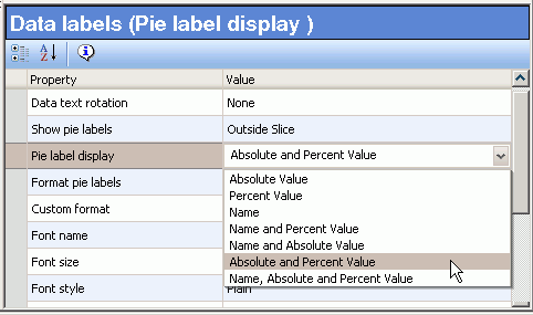
As shown in the following image, you can select from: Absolute
Value; Percent Value; Name; Name and Percent Value; Name and Absolute
Value; Absolute and Percent Value; or Name, Absolute, and Percent
Value.

Procedure: How to Select Display Options for Pie Chart Labels
-
Click the Chart editor tab.
-
In the Chart folder, click the Data
labels form.
The Data
labels chart editing form appears below the graph preview area.
-
Click
the Value column area to the right of Show pie labels in the Property
column.
A drop-down arrow appears at the far right edge of the
row in the Value column.
-
Click
the down arrow to open the drop-down list.
-
Select On
Slice, Outside Slice, or Outside
with feeler lines.
Note: If Show pie labels is set to Hide, no labels
are displayed for the pie slices.
-
Click
the Value column area to the right of Pie label display in the Property
column.
A drop-down arrow appears at the far right edge of the
row in the Value column.
-
Click
the down-arrow to open the drop-down list.
-
Select
one of the available pie label display options.
The option you selected appears in the graph preview area.
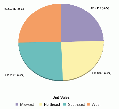
For
example, in the following image, Absolute and Percent value is the
selected Pie label display option, and Outside Slice is the selected
Show pie labels option:


 icon
in the query pane below the Available Fields tab.
