WebFOCUS
Online Help > InfoAssist > Creating and Customizing Chart Queries > Utilizing Chart Features
You can utilize the following features when creating
chart queries:
- Rotate
the orientation of a chart. For details, see How to Rotate a Chart.
- Add reference
lines to a chart. For details, see How to Display Reference Lines in a Chart.
- Add annotation
lines to a chart. For details, see How to Display Annotation Lines in a Chart.
- Change the
display of grid lines in a chart. For details, see How to Display Grid Lines in a Chart.
- Add a trendline
to a chart. For details, see How to Display Trendlines in a Chart.
- Customize
axes labels in a chart. For details, see How to Customize the Display of Axes Labels in a Chart.
- Customize
the display of legend labels in a chart. For details, see How to Customize the Display of Legend Labels in a Chart.
- Add data
labels to a chart. For details, see How to Display Data Labels in a Chart.
- Customize
the use of aggregation options for displaying measure data in a
chart. For details, see How to Display Measure Data Using Aggregation Options in a Chart.
- Apply traffic
light conditional styling to the data in a chart. For details, see How to Display Traffic Light Conditional Styling in a Chart.
- Display line
charts using smooth lines. For details, see How to Display Smooth Lines in a Chart.
- Customize
the use of markers in a chart. For details, see How to Customize the Display of Markers in a Chart.
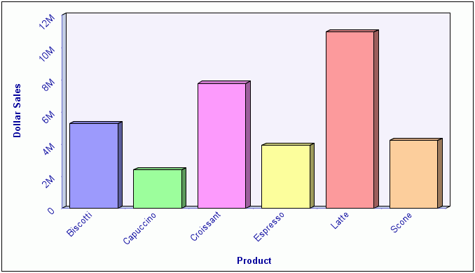
Procedure: How to Rotate a Chart
You
can rotate bar, line, and area chart types to change the orientation
of the data.
-
Create a chart query.
-
Select the Format tab in the Control Panel.
-
Select Rotate in the Features menu.
-
Run the chart.
The chart is rotated 90 degrees clockwise. The following
image shows an example of a bar chart that is rotated.
Procedure: How to Display Reference Lines in a Chart
You
can add up to three horizontal (X-Axis) and three vertical (Y-Axis)
reference lines to a chart to draw attention to specific data locations.
-
Create a chart query.
-
Select the Format tab in the Control Panel.
-
Select Reference in the Features menu.
-
In the drop-down menu that opens, select one of the following:
- Add Reference Line to Y-Axis
- Add Reference Line to X-Axis
The Reference Line dialog box opens, as shown in the following
image.
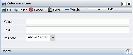
-
In the Value field, type the specific X or Y-Axis value where
you want the reference line to be displayed.
-
In the Text field, type the desired text for the reference line.
-
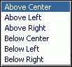
Select the desired position of the reference line on the chart
using the Position drop-down menu.
The choices are Above Center, Above Left, Above Right,
Below Center, Below Left, and Below Right, as shown in the following
image.
-
Set the desired Color, Weight, and Style values of the reference
lines.
The choices for Weight are 1px Light, 2px Medium, and 3px
Heavy.
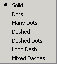
The choices for Style are Solid, Dots, Many Dots,
Dashed, Dashed Dots, Long Dash, and Mixed Dashes, as shown in the
following image.
Selecting Color opens
the color selection dialog box where you can select standard and
custom colors. Note that the selected color is applied to both the
reference line and the text.
-
Run the chart.
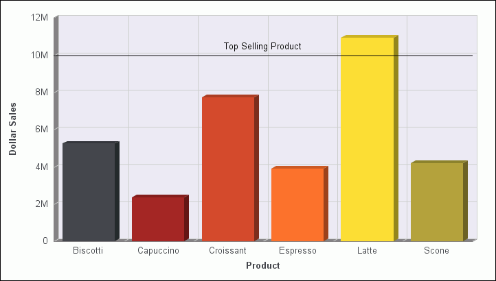
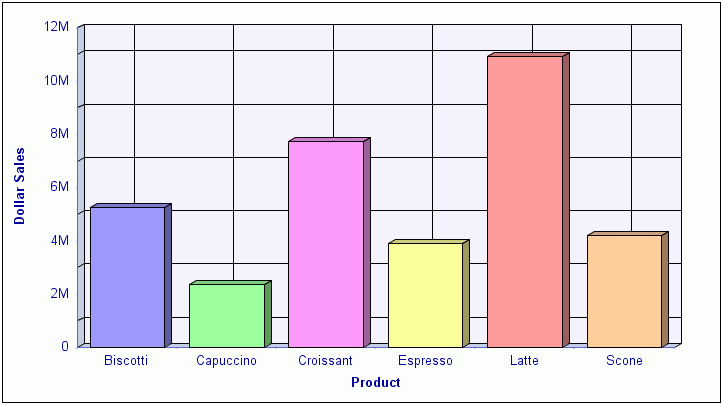
The reference line is added to the chart. The following
image shows an example of a chart with a reference line added by
typing 10000000 in the Value field and Top Selling Product in the
Text field using the default Above Center setting for Position.
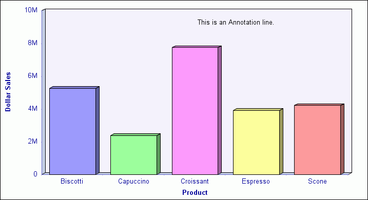
Procedure: How to Display Annotation Lines in a Chart
You
can add up to eight annotation lines to a chart to draw attention
to specific areas.
-
Create a chart query.
-
Select the Format tab in the Control Panel.
-
Select Annotate in the Features menu.
-
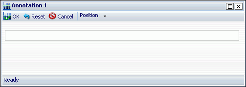
In the drop-down menu that opens, select Add an Annotation.
The Annotation dialog box opens, as shown in the following
image.
-
In the text input field, type the desired text for the annotation
line.
-
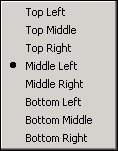
Select the desired position of the annotation line on the chart
using the Position drop-down menu.
The choices are Top Left, Top Middle, Top Right, Middle
Left, Middle Right, Bottom Left, Bottom Middle, and Bottom Right,
as shown in the following image.
-
Run the chart.
The annotation line is added to the chart. The following
image shows an example of a chart with an annotation line of text
added to it.
Procedure: How to Display Grid Lines in a Chart
You
can add O1 Minor Gridlines and Y1 Minor Gridlines to the O1 Major
Gridlines and Y1 Major Gridlines that are displayed by default in
a chart.
-
Create a chart query.
-
Select the Format tab in the Control Panel.
-
Select Grid lines in the Features menu.
-
In the drop-down menu that opens, select or deselect any of
the grid line options.
The O1 Minor Gridlines and Y1 Minor Gridlines options are
unselected by default and the O1 Major Gridlines and Y1 Major Gridlines
options are selected by default.
-
To select or deselect other grid line options, repeat steps
3 and 4.
-
Run the chart.
The selected grid lines are added to the chart and any
deselected grid lines are removed from the chart. The following
image shows an example of a chart with both of the optional grid
lines (O1 Minor Gridlines and Y1 Minor Gridlines) displaying in
the chart, along with both of the default grid lines (O1 Major Gridlines
and Y1 Major Gridlines).
Note
that you can deselect any of the grid lines, including the default
grid lines, from displaying in a chart.
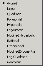
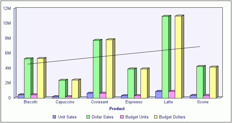
Procedure: How to Display Trendlines in a Chart
-
Create a chart query.
-
Select the Series tab in the Control Panel.
-
Select Trendline in the Properties menu.
-
In the drop-down menu that opens, as shown in the following
image, the choices are None (the default), Linear, Quadratic, Polynomial,
Hyperbolic, Logarithmic, Modified Hyperbolic, Rational, Exponential,
Modified Exponential, Log, Quadratic, and Geometric.
-
Optionally, to display the mathematical equation on the chart
for the selected trendline option, select Equation in
the Properties menu of the Series tab.
-
Run the chart.
The chart displays the selected trendline option. The following
image shows a trendline displayed using the Linear option.
Procedure: How to Customize the Display of Axes Labels in a Chart
You
can display, hide, stagger, and rotate both the X-Axis (01) and
Y-Axis (Y1) labels by making selections in the Axes drop-down menu.
-
Create a chart query.
-
Select the Format tab in the Control Panel.
-
Select Axes in the Labels menu.
-
In the drop-down menu that opens, select or deselect any of
the following axes display options.
- Show O1-Axis Labels (selected by default)
- Show Y1-Axis Labels (selected by default)
- Stagger O1-Axis Labels
- Stagger Y1-Axis Labels
- Rotate O1-Axis Labels
- Rotate Y1-Axis Labels.
The two Rotate options provide a choice of None (the default
value), 45, 90, and 270 degrees.
-
To select or deselect other axes display options, repeat steps
3 and 4.
-
Run the chart.
The selected axes display options appear in the chart and
any deselected axes display options are removed from the chart.
The following image shows an example of a chart with both the Rotate
O1-Axis Labels and Rotate Y1-Axis Labels options selected and set
to 45 degrees.
Procedure: How to Customize the Display of Legend Labels in a Chart
You
can add or remove legend labels from a chart.
-
Create a chart query.
-
Add a data source field to the Legend (Series) field container
in the Query Design pane.
-
Select the Format tab in the Control Panel.
-
Select Legend in the Labels menu.
-
In the drop-down menu that opens, perform one of the following:
- Select or deselect Show Legend.
- Select Legend Position and choose
one of the available options. The choices for positioning the chart
legend are Auto (the default), Bottom, Right, Left, Top, Right bottom,
Right top, Left bottom, Bottom right, Top right, Bottom left, and
Top left, as shown in the following image.
- Select Legend Orientation and choose
one of the available options. The choices are Auto (the default),
Vertical, and Horizontal.
-
To select another option, repeat steps 3 and 4.
-
Run the chart.
The selected legend display options appear in the chart
and any deselected legend display options are removed from the chart.
The following image shows an example of a chart with the Legend
Position set to Right Bottom and the Legend Orientation set to Vertical.
Procedure: How to Display Data Labels in a Chart
You
can rotate bar, line, and area chart types to change the orientation
of the data.
-
Create a chart query.
-
Select the Series tab in the Control Panel.
-
Select Data Labels in the Properties menu.
-
In the drop-down menu that opens, select or deselect any of
the following data labels display options.
- None (the default)
- Above
- On top edge
- Below top edge
- Center
- Base
-
Run the chart.
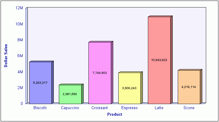
The chart displays the selected data labels option. The
following image shows data labels displayed using the Center display
option.
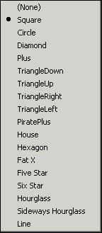
Procedure: How to Customize the Display of Markers in a Chart
You
can customize the display of data and legend markers in a chart.
By default, markers for points of data are not displayed in charts
created with InfoAssist. The exception is the scatter chart type,
which only displays points of data.
-
Create a chart query.
-
In the Query Design pane, select the desired data for which
you want to display data and legend markers.
-
Select the Series tab in the Control Panel.
-
Select Marker in the Properties menu.
-
In the drop-down menu that opens, as shown in the following
image, the data marker display options are None, Square (the default),
Circle, Diamond, Plus, Triangle Down, Triangle Up, Triangle, Right,
Triangle Left, Pirate Plus, House, Hexagon, Fat X, Five Star, Six
Star, Hourglass, Sideways Hourglass, and Line.
-
Run the chart.
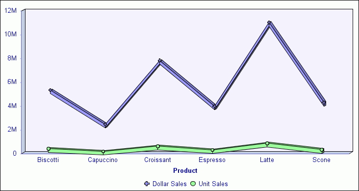
The chart displays the selected marker option. The following
image shows the selected Plus (sign) marker option used to display
points of data on the chart and in the legend for the selected Dollar
Sales measure field.
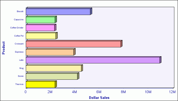
Procedure: How to Display Measure Data Using Aggregation Options in a Chart
You
can display numeric measure data using a variety of aggregation
type values other than the default of Sum.
-
Create a chart query.
-
Select the desired numeric measure data source field in the
Query Design pane.
The Field tab displays in the Control Panel.
-
Select Aggregation from the Specific
menu or right-click the selected measure field and select Aggregation Functions.
-
In the pop-up menu that opens, as shown in the following image,
the choices are Sum (the default), Average, Count, Percent of Count,
First Value, Last Value, Maximum, Minimum, Total, Percent, Row Percent,
and Average Square.
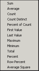
Note: If you
change the Measure field container from Sum to Print, Count, or
List, it overrides all assigned aggregation type values.
-
Run the chart.
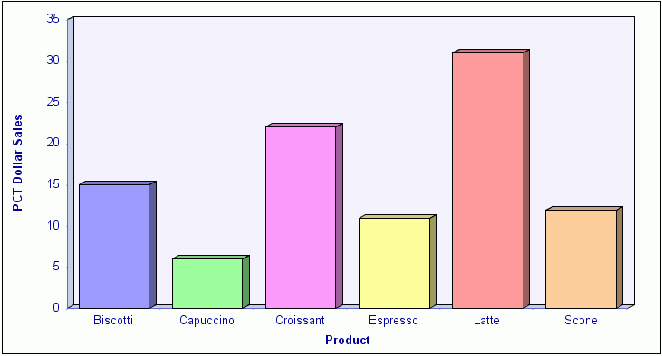
The following image shows an example of a chart produced
by assigning the Percent (PCT) aggregation option to the Dollar
Sales field in the query.
Procedure: How to Display Traffic Light Conditional Styling in a Chart
You
can apply traffic light conditional styling to data displayed in
a chart for a selected numeric measure field. By default, the first
condition displays values in green and the second condition displays
values in red.
-
Create a chart query.
-
Select the desired numeric measure data source field in the
Query Design pane.
The Field tab is displayed in the Control Panel.
-
Select Traffic Lights from the Specific menu.
The Traffic Light Condition dialog box opens displaying
the green light selection fields where you can select and enter
green light criteria.
-
From the drop-down menu below the selected data source field
name, choose one of the following relational operators:
- Equal to
- Not equal to
- Greater than
- Less than
- Greater than or equal to
- Less than or equal to
-
In the field to the right of the operator drop-down menu, enter
the desired value for the selected operator to display data values
in green in the report output for the selected data source field.
or
Select an option from the Values drop-down menu
and select the desired data value in the Data Values dialog box
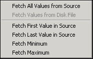
that opens. From the Values drop-down menu, as shown in the following
image, you can select Fetch All Values from Source, Fetch Values from
Disk, Fetch First Value in Source, Fetch Last Value in Source, Fetch
Minimum, or Fetch Maximum.
-
Click Add New.
The red light selection fields are displayed in the Traffic
Light Condition dialog box where you can select and enter red light
criteria.
-
From the red light drop-down menu, choose the desired relational operator.
-
In the field to the right of the red light drop-down menu,
enter the desired value for the selected operator to display data
values in red in the report output for the selected data source
field.
or
Select an option from the Values drop-down menu
and select the desired value in the Data Values dialog box that
opens.
-
Click OK when you are ready to close
the Traffic Light Condition dialog box.
In the Traffic Light Condition dialog box:
- You can delete
an existing traffic light condition by clicking the Remove button.
- You can perform
styling and change colors by clicking the Style button.
In the Style pop-up menu that opens, clicking the color
 icon
opens the color selection dialog box where you can select a different
color than the default green and red colors that appear for the
first two conditions. When selecting colors, you can click a color
square on the left side of the dialog box or click an area of the
color palette on the right side of the dialog box. You can also
select colors by typing numbers in the Hue, Sat, Lum, Red, Green,
and Blue fields or by using the up and down arrows next to each
field to set numeric values.
icon
opens the color selection dialog box where you can select a different
color than the default green and red colors that appear for the
first two conditions. When selecting colors, you can click a color
square on the left side of the dialog box or click an area of the
color palette on the right side of the dialog box. You can also
select colors by typing numbers in the Hue, Sat, Lum, Red, Green,
and Blue fields or by using the up and down arrows next to each
field to set numeric values.
- You can add
more traffic light conditions by clicking Add New and
selecting a different color for each new condition that you add.
-
Run the chart.
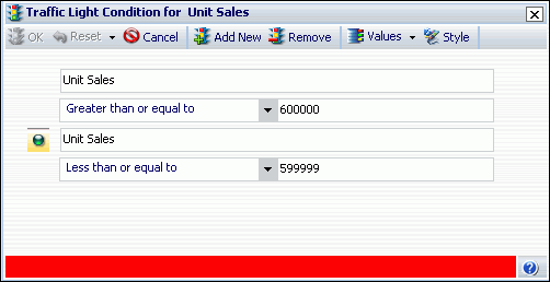
The
following image shows the Traffic Light Condition dialog box with
criteria to display report output showing Unit Sales greater than
or equal to 600000 in green and Unit Sales less than or equal to
599999 in red.
The following image
shows the resulting chart that has traffic light conditional styling applied
to the Unit Sales data using red and green colors according to the
criteria specified in the Traffic Light Condition dialog box.
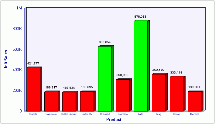
Note that the chart
above also displays data labels for each Unit Sales measure value.
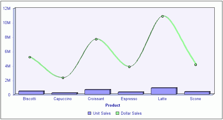
Procedure: How to Display Smooth Lines in a Chart
-
Create a chart query and do one of the following:
- Select the Format tab and
select Line from the Chart Types menu.
- In any type of chart, select the desired numeric measure
data source field in the Query Design pane, select the Series tab,
select Type in the Properties menu, and select Line.
Use this technique to create a chart that displays different types
of chart data for different measure fields (for example, bar and line).
-
Select the Series tab and select Smooth
Line in the Line menu.
-
Run the chart.
The chart displays smooth lines. The following image shows
the Dollar Sales field, which had the Line type applied, showing
smooth lines, along with the Unit Sales field displaying bar chart
data.