WebFOCUS
Online Help > Managed Reporting Developer > Creating Graphs With Advanced Graph Assistant > Selecting Data for a Graph
Selecting Data for a Graph
In this section: How to: Reference: |
The data fields you select and the graph dimensions
you add these fields to determine the appearance and usefulness
of your graph. For most chart types, fields consisting of numeric
values are added to the vertical Y-axis dimension, while non-numeric and
date values are normally added to the horizontal X-axis dimension.
In addition to the X-axis and Y-axis dimensions, you can add
fields to Multi-graph and Series-legend dimensions when creating
multiple and merged graphs. For details, see Creating Multiple Graphs With Advanced Merge. You can also add fields
to specialized dimensions for certain chart types including pie,
bubble, stock, and gauge. For details, see Selecting Data for Specialized Dimensions.
Procedure: How to Select Data for a Graph
-
Click
the Data selection tab.
The Available Fields tab, located below the Data selection
pane, is selected by default to show all of the available fields
in the data source you selected when opening Advanced Graph Assistant.
If the Join tab is selected instead, click Available
Fields.
-
Add a field to the graph using one
of the following three methods.
- Drag a field
into the graph preview area and drop it on the desired axis, or
other type of dimension, in the pop-up dialog box that appears.
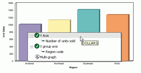
You can also multi-select fields before dragging and dropping. In
the following image, the DOLLARS field is dragged and dropped on
the Y Axis label in the graph preview area.
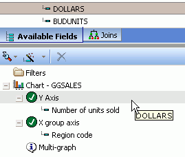
- Drag a field
into the query pane below the Available Fields tab and drop it on the
desired axis, or other type of dimension. You can also multi-select
fields before dragging and dropping. In the following image, the
DOLLARS field is dragged and dropped on the Y Axis label in the
query pane:
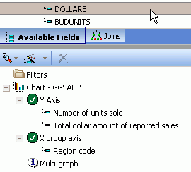
- Double-click a field to automatically
add it to the appropriate axis in the query pane below the Available
Fields tab. The following image shows the DOLLARS field added to
the Y Axis dimension.
Note: When
you double-click a field to add it to the graph automatically, a
numeric field is added to the Y-axis (or other specialized dimension),
while a non-numeric or date field is added to the X group axis (or
other specialized dimension).The graph preview area is automatically
updated to display any changes. The following image shows how the
graph changes by adding the DOLLARS field to the Y-axis.
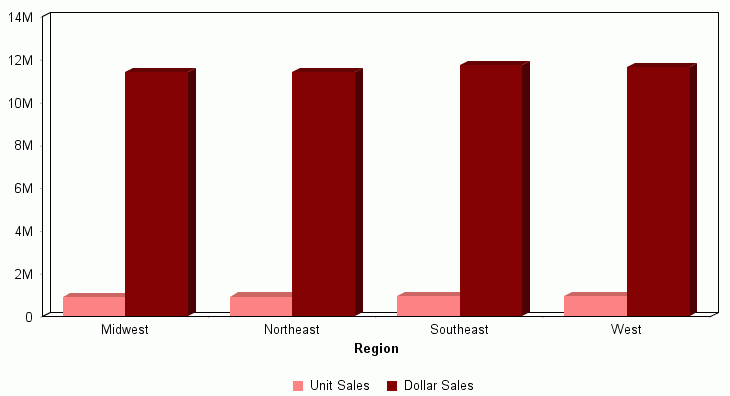
New columns were added to represent
both the Unit Sales and Dollar Sales, the Unit Sales Y-axis label
was moved to the legend at the bottom of the graph, and Dollar Sales
was added to the legend.
Note: When
the number of Y-axis fields is greater than one, the corresponding
data labels appear in the legend below the X-axis label.
Reference: Selecting Data for Specialized Dimensions
Some specialized
chart types utilize dimensions other than the Y-axis, X group axis,
and Multi-graph dimensions.
For the
following chart types, data fields can be added to these specialized
dimensions.
-
Pie charts. You
can add data to the specialized Measures and Pie slices dimensions,
as well as the Multi-graph dimension, as shown in the following image.

-
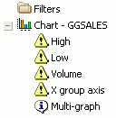
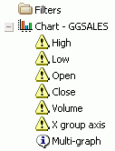
Stock charts. Depending
on the specific stock chart type you select, you can add data to
some or all of the specialized High, Low, Open, Close, and Volume dimensions,
as well as the X group axis and Multi-graph dimensions, as shown
in the following images.
-
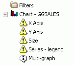
Bubble. You
can add data to the specialized Size dimension, as well as the X
Axis, Y Axis, Series-legend, and Multi-graph dimensions, as shown
in the following image.
-
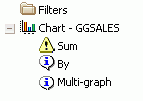
Gauge. You
can add data to the specialized Sum and By dimensions, as well as
the Multi-graph dimension, as shown in the following image.
Selecting Multiple Fields
In the Available Fields tab of Advanced Graph Assistant,
you can select and add multiple fields to a graph using one of the
following methods:
- Select
multiple fields, drag them into the graph preview area, and drop
the fields on the desired axis, or other type of dimension, in the
pop-up dialog box that appears.
- Select multiple
fields, drag them into the query pane below the Available Fields
tab, and drop the fields on the desired axis, or other type of dimension.
Note: To select multiple fields, highlight multiple fields
with your mouse by holding the Shift key to select items contiguously,
or the Control key to select items non-contiguously.
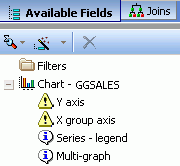
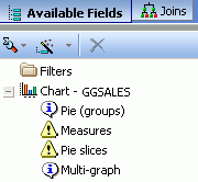
Intelligent data mapping displays
the dimensions that are required and optional for the chart type
you select. Yellow triangle icons indicate required fields and white callout
icons represent optional fields.
The following images show how intelligent
data mapping works. The first image shows the required and optional
dimensions when you select a bar chart type, and the second image
shows the required and optional dimensions when you select a pie
chart type.
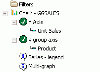
When data fields are added to required dimensions, the yellow
triangle icons are replaced with round green check mark icons to
indicate fulfillment, as shown in the following image.
Selecting Data View Options
The data fields you select can be displayed in different
ways depending on the type of data view chosen at the top of the
Available Fields pane. You can view a selected data source in a
hierarchy tree, in a dimension/measure tree, or in a data source
grid. These are specific data view buttons and options you can select:
- Click
 to
view a selected data source in a data hierarchy tree. Use the drop-down
list to the right of this button to select the option to view data
fields by name, title, or description.
- Click
 to
view a selected data source in a dimensions/measure tree. Use the
drop-down list to the right of this button to select the option
to view data fields by name, title, or description.
to
view a selected data source in a dimensions/measure tree. Use the
drop-down list to the right of this button to select the option
to view data fields by name, title, or description.
- Click
 to
view a selected data source in a data source grid. In this type of
view, any or all of the following data attributes are available:
name, alias, title, format, description, segment, and filename.
Use the drop-down list to the right of this button to select the
attributes you want displayed when viewing data fields.
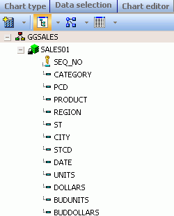
The following image shows data fields displayed as names in the
data hierarchy tree view.

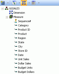
The following image shows data fields displayed as titles in
the dimension/measure tree view.

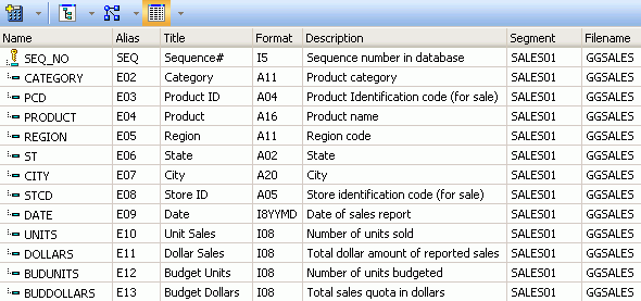
The following image shows data fields displayed in the selected
data source grid after all available attributes were selected and
the Available Fields pane was widened (by dragging the right border
further to the right).


 to
view a selected data source in a data hierarchy tree. Use the drop-down
list to the right of this button to select the option to view data
fields by name, title, or description.
  to
view a selected data source in a dimensions/measure tree. Use the
drop-down list to the right of this button to select the option
to view data fields by name, title, or description.
to
view a selected data source in a dimensions/measure tree. Use the
drop-down list to the right of this button to select the option
to view data fields by name, title, or description.  to
view a selected data source in a data source grid. In this type of
view, any or all of the following data attributes are available:
name, alias, title, format, description, segment, and filename.
Use the drop-down list to the right of this button to select the
attributes you want displayed when viewing data fields.