WebFOCUS Online Help > Managed Reporting End User > Analyzing Data in an OLAP Report > Displaying Graphs and Reports
How to:
Reference: |
When you graph a measure in an OLAP report, you select the specific data elements to include and view the tabular report and a graphical representation of the identical information simultaneously in a split window. The graph appears in a frame in the top half of the window to facilitate comparison.
To be graphable, the data in the report must include at least one numeric measure and one sort field (By or Across). The Graph control is activated in the Selections pane or the Control Panel when these basic requirements are met.
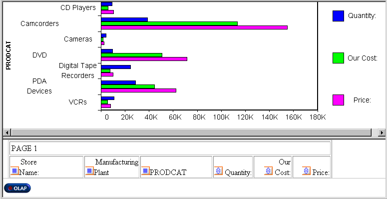
As shown in the following image, it includes three sort fields (PRODCAT, Store Name, and Manufacturing Plant) and three numeric measures (Quantity, Our Cost, and Price), displayed as horizontal bar charts for quick comparison.
You can request a graph from an OLAP report, from the Selections pane, or from the Control Panel:
If you choose to graph more than one measure, you can employ different graph types to suit the data in each column, with the following restrictions:
For details about supported combinations, see Combining Graph Styles and Measure Styles in OLAP Graphs.
Note: If drill down capability has been enabled for the dimensions in a report, the same functionality is automatically enabled for graphs. You can, therefore, drill down from one graphical representation of your data to another.
The following table lists the available style combinations in the second column for each graph style in the first column.
|
Controlling Graph Style |
Potential Measure Styles |
|---|---|
|
Vertical Bar (default) |
Vertical Bar (default) |
|
Vertical Line | |
|
Vertical Area | |
|
Vertical Line |
Vertical Line (default) |
|
Vertical Bar | |
|
Vertical Area | |
|
Vertical Area |
Vertical Area (default) |
|
Vertical Bar | |
|
Vertical Line | |
|
Horizontal Bar |
Horizontal Bar (default) |
|
Horizontal Line | |
|
Horizontal Area | |
|
Horizontal Line |
Horizontal Line (default) |
|
Horizontal Bar | |
|
Horizontal Area | |
|
Horizontal Area |
Horizontal Area (default) |
|
Horizontal Line | |
|
Horizontal Area | |
|
Pie |
Pie |
There is a check pane to the left of each measure and a graph button to the right of each measure. All check panes are unchecked by default and all graph buttons are grayed (inactive) by default.
The graph button to the right of the measure becomes active. The default graph style is Vertical bar.
For a list of graph types that can be defined, see Combining Graph Styles and Measure Styles in OLAP Graphs.
The graph opens in a separate frame above the report and Selections pane.
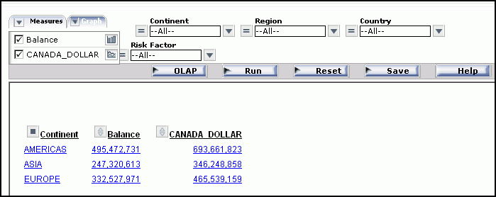
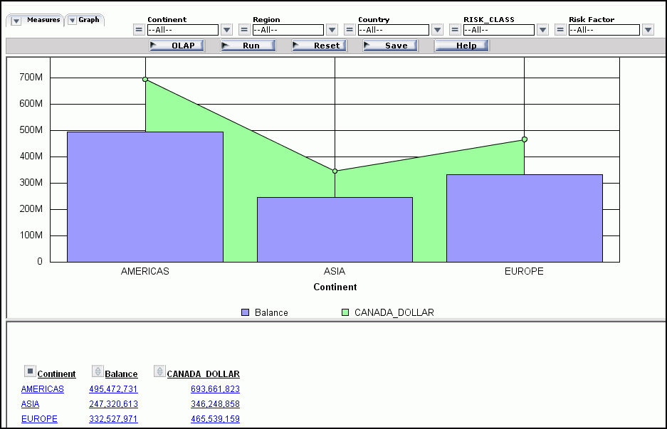
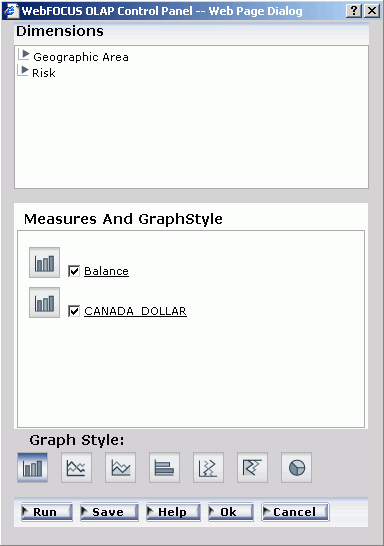
This example contains two measures, BALANCE and CANADA_DOLLARS, sorted by Continent. You would like to see graphical representations of both measures. To contrast the graphical information, you use a different graph type for each one.
As shown in the following image, the Selections pane has the Graph control listing BALANCE represented as a vertical bar and CANADA_DOLLAR represented as a vertical area.
The following image shows the results of the graph selections.
The following procedure is an example of creating a pie chart from the Selections pane.
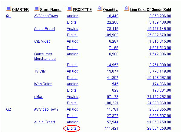
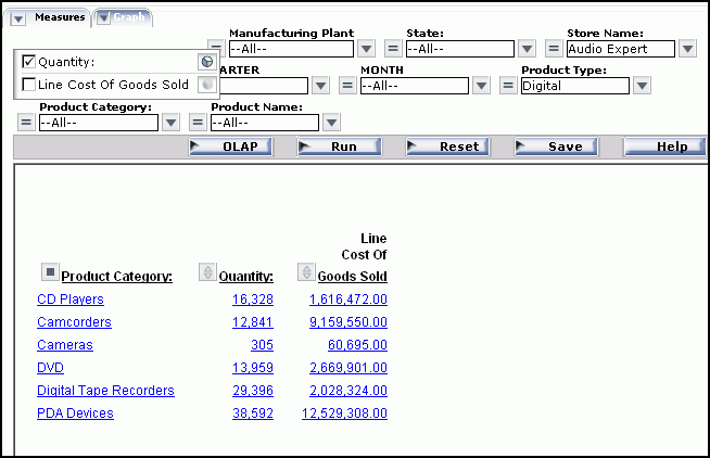
The report shows order information for stores that sell Century Corporation's electronic products. Audio Expert shows the highest numbers, with orders of digital products significantly exceeding analog.
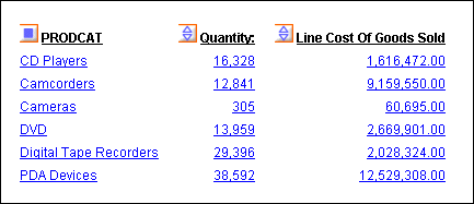
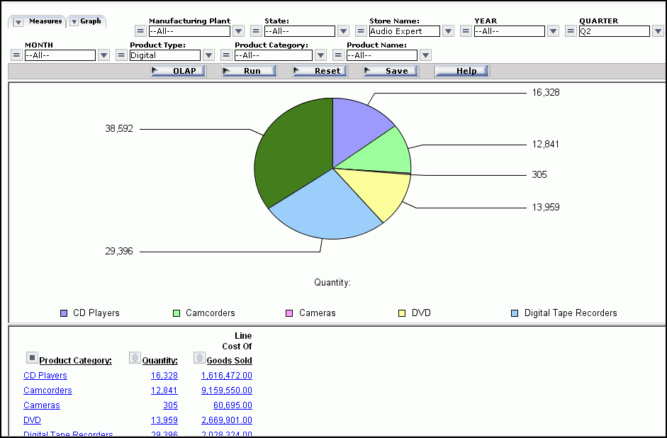
You want a clearer picture of how the digital orders breakdown by product so you decide to create a pie chart.
The report now shows the Quantity and Line Cost of Goods sold for several digital products sold at Audio Expert in Q2 as shown in the following image.
As shown in the following image, the graph appears in a pane above the report. You can see at a glance that PDA Devices constituted about 1/3 of digital sales at the Audio Expert store in Q2.
Note that the contents of the Drill Down and Drill Across panes determine the X-axis fields. When there are multiple drill (X-axis) fields, multiple graphs appear vertically stacked in the same frame. The measures appear as Y-axis fields on the graphs you display.
The Measures and GraphStyle pane opens.
Check panes associated with the available measures are unchecked by default.
The graph icon corresponding to the controlling graph style appears next to each selected measure.
Note:
| WebFOCUS |