WebFOCUS
Online Help > Managed Reporting End User > Creating a Graph With Graph Assistant > Selecting a Graph Type and Style
Selecting a Graph Type and Style
When creating a graph, it is important to select the appropriate
graph type with which to display your data. You may select from
a number of basic graph types, as well as refinements on these types,
known as graph styles. Basic graph types include line graphs (connected
point plots), bar graphs, pie graphs, and scatter graphs. Use the
brief descriptions (see Graph Types) to select a graph type that suits the data set you
are displaying and the change you want to highlight. Keep in mind
that the data are the sets of numbers that you are displaying, and
the scales are the numbers or variable measures that appear along
the axes of the graph.
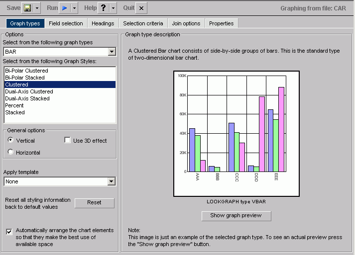
The Graph types tab of the Graph Assistant provides a list and
brief descriptions of the many graph types and graph styles available
in WebFOCUS.
Note: When using a stacked chart of any type at least
2 series are required. Negative values are not supported in stacked
charts.
The following image shows the Graph types tab with a sample cluster
bar chart.
Following are descriptions of the types of graphs you
can create:
-
Line graphs. Line
graphs are useful for emphasizing the movement or trend of numerical
data over time, since they allow a viewer to trace the evolution
of a particular point by working backwards or interpolating. Highs
and lows, rapid or slow movement, or a tendency towards stability
are all types of trends that are well suited to a line graph.
Line
graphs can also be plotted with two or more scales to suggest a
comparison of the same value, or set of values, in different time
periods. The number of scales your graph has depends on the type
of graph you select. There is a description of each available graph
type on the Graph types tab of the Graph Assistant.
-
Bar graphs. Bar
graphs plot numerical data by displaying rectangular blocks against
a scale. The length of a bar corresponds to a value or amount. Viewers can
develop a clear mental image of comparisons among data series by
distinguishing the relative heights of the bars. Use a bar graph
to display numerical data when you want to present distributions
of data. You can create horizontal as well as vertical bar graphs.
-
Pie graphs. Pie
graphs emphasize where your data fits in relation to a larger whole.
Keep in mind that pie graphs work best when your data consists of
several large sets. Too many variables divide the pie into small
segments that are difficult to see. Use color or texture on individual
segments to create visual contrast.
-
Scatter graphs. Scatter
graphs share many of the characteristics of basic line graphs. Data
can be plotted using variable scales on both axes. When you use
a scatter graph, your data is plotted using a basic line pattern.
Use a scatter graph to visualize the density of individual data
values around particular points or to demonstrate patterns in your
data. A numeric X-axis, or sort field, will always yield a scatter
graph by default.
It is important to note that scatter graphs
and line graphs are distinguishable from one another only by virtue
of their X-axis format. Line graphs can appear without connecting
lines (making them look like scatter graphs) and scatter graphs
can appear with connecting lines (making them look like line graphs).
-
Area graphs. Area
graphs are similar to line graphs except that the area between the
data line and the zero line (or axis) is usually colored or textured.
Area graphs allow you to stack data on top of each other. Stacking
enables you to highlight the relationship between data series, showing
how some data series approach or shadow a second series.
-
3D graphs. 3D
graphs add dimension to your graphing presentation. Dimensionality
enables your viewers to recognize trends based on two or more data sets
easily. 3D graphs also add impact to your presentation.
-
Bubble charts. Bubble
charts are used to display three dimensions, requiring only three
COLUMN fields representing X, Y, and Z data values in that order. The
data points can be either opaque or transparent bubbles. If you
want to visualize the precise data point, you can add a dot in the
center of the bubble. The size of the bubbles are proportional to
the values they represent.
-
Polar graphs. The
Graph Assistant supports two styles of Polar graphs: an XY Polar
Chart or a polar coordinate scatter chart and an XY Polar Dual-Axis
Chart or a Dual-Y polar coordinate chart. In both styles, only one
Column field is allowed in the following order: X (degree) for the
Column field and Y (distance from the center) for the Across/By
field.
-
Radar graphs. Radar
graphs are used to compare two or more data sets. You can use axes
or polygons to represent values in a star or spider configuration.
They are essentially analogous to a line chart, except that the
scale wraps around. Radar graphs work well with any data that are
cyclical, such as the months of a year.
-
Stock Chart. Stock
charts are used to track the trend of a particular stock. Stock
charts show the stock's volume, opening and closing values as well
as the stock's high and low values over a specific time period.
The data is represented by sets of bars and/or lines.
-
Histogram. Histograms
depict the distribution of a data set by grouping all of the data
together and assigning it to buckets based on their value. You only measure
one variable in histograms. After the data is sorted by this variable,
you count the number of instances of this data. This determines
the height of each bar. For example, if a company wanted to measure
how many franchises there are in each class of annual revenue, a
histogram would show the number of franchises that have 1,000,000
to 2,000,000; 2,000,000 to 5,000,000; 5,000,000 to 10,000,000; and 10,000,000
to 15,000,000.
-
Multi-y. A
Multi-y is a vertical, triple/quadruple/quintuple-Y-axis clustered bar
chart. Any series can be assigned to any of the triple/quadruple/quintuple axes.
-
Waterfall. A
Waterfall chart is a cumulative stacked chart. The waterfall chart
will automatically perform the cumulative sum when using Subtotal
or Total. Waterfall charts essentially require one data value for
each series or group marker to be drawn in a chart.
-
Miscellaneous. The
Miscellaneous Graph Type includes a variety of Graph Styles:
-
Default (Circular Gauge). A
Gauge Chart usually indicates the current position of a value within
a given spectrum.
-
Funnel. A
Funnel Chart is basically a pie chart displaying only one group
of data at a time from the first series to the last series at the
bottom of the funnel.
-
Pareto. The
X-axis scale is for the group members. The Y-axis scale is the percent
of the total accumulation for each selected series.
-
Product Position. A
Product Position chart provides a visual representation of market
share and growth versus revenue and measurement (past, present,
and future). Product Position charts require a set of three display fields.
-
Resource Return. Resource
charts plot X- and Y-axis data cumulatively. They are useful for
plotting two independent variables against each other, particularly
in cases where one or both of the axes specify percentages and the
user wants to examine issues such as capacity utilization.
-
Spectral Map. This
is a Spectral Map Chart. This is a chart with row or column matrix
of markers that are colored according to data values.
You can choose among several graph styles for each graph
type. First you select the graph type with which you want to work
in the Graph Type drop-down list box, and then you select the graph
style from the Graph Styles drop-down list box. A thumbnail graph with
a graph type and style definition appears to the right on the Graph
types tab.
Previewing Styling Options for Your Graph
The graph in the Graph Preview window displays the graph type
and style you chose as well as any styling information you specified
from the template drop-down list or in the Properties tab. The Preview does not open
by default for other resolutions. In this case, you have to click
the Show Preview button.
The following image is of a bar graph that uses the 3DBAR graph
style. This generic chart is a two-dimensional chart with three-dimensional
type bars.
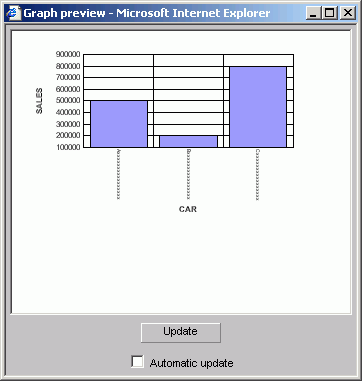
The data used for this Graph
Preview is built with the selected data sources' field format types
and lengths of the data. In this case, the X-axis field (car) is
alphanumeric (A16) and will be displayed as Axxxxxxxxxxxxxxx as
the series label
where:
- A
-
Represents the data type alphanumeric.
- xxxxxxxxxxxxxxx
-
Indicates the number of characters or digits allowed.
The Y-axis (dealer cost and
retail cost) scale is based on a data range of selected Y-axis fields.
You can manually update the Graph Preview by clicking the Update
button to see how your changes will look in a graph. You can choose
to have the Graph Preview updated automatically any time you make
changes by selecting the Automatic update check box.
Important:
- The graphical
representation in the Graph Preview is based on an internal algorithm
to help show the type and style of the graph. It is not a true representation
of your particular data. However, legends and axis labels will reflect
selected fields, formats and positioning.
- An X11 Server
is necessary when using Graph Preview on Unix installations.
- Merged graphs
are not supported in the Preview panel.
Auto Arranging Graph Elements
The auto arrange feature enables the Graph Preview to
arrange all the elements in a graph report efficiently. The auto
arrange feature is checked by default.
Procedure: How to Arrange the Elements of a Graph Efficiently
Check
the Automatically
arrange the chart elements so that they make the best use of the
available space option.
Note: This option is
checked by default. If you uncheck this feature, WebFOCUS will arrange
the elements.
Example: Comparing the Arrangement of the Elements of a Graph
In
the Graph types tab:
- Uncheck the Automatically arrange the
chart elements so that they make the best use of the available space option.
- Click Show Graph Preview.
The Graph preview
window opens. The following image shows the Graph types tab with
a sample bi-polar stacked bar chart of a sales report with sales
and mpg dimensions.
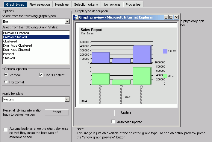
Note how the MPG symbol
partially blocks the data along the right Y-axis.
- Now check the Automatically arrange the chart elements
so that they make the best use of the available space option.
A
new Graph preview window opens. The following image shows the same
bi-polar stacked bar chart with the elements arranged automatically.
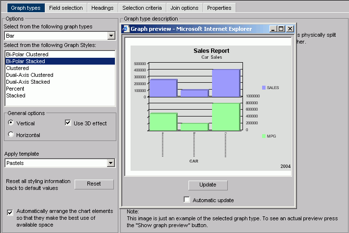
Note how the Y-axes
labels and X-axis labels fit within the size of the report.
Procedure: How to Select a Graph Type and Style
-
Highlight
a graph type from the Graph Type list on the Graph types tab of
the Graph Assistant. Next, highlight a graph style from the Graph Styles
drop-down list.
A thumbnail image and a brief description of the graph
are provided when you highlight a graph type and style. Be sure
to read the description of the graph before selecting a graph type
and style. Certain graph types require a particular number and/or type
of data values; therefore, if your data does not satisfy the requirements,
your graph will not accurately represent your data.
-
After
you have found the graph type and style you desire, click the next tab
to continue creating your graph.
After you have chosen a graph type, you should select
an appropriate scale. A scale is a classification scheme or series
of measures that you select for application to the axes of your
graph. The scale provides the framework against which your data
are plotted. When you choose an appropriate scale for your data,
meaningful patterns can emerge, and when you modify a scale, the
overall shape of your graph changes.
Steps or measures in the scale are represented along the axes
of your graph by marks. The type of scale you choose determines
the number of divisions along the scale. There are two general types
of scales you can apply to the y-axis of your graph:
- Linear
scales
- Logarithmic
scales
A linear scale is a scale in which the values increase arithmetically.
Each measure along the scale is one unit higher than the one that
precedes it. Linear scales are useful when the data you are plotting
are relatively small in range.
A logarithmic scale is a scale in which the values increase logarithmically.
Each measure along the scale represents an exponential increase
in the data value. Logarithmic scales are useful when you need to
accommodate a large range of numbers.
Procedure: How to Select Scales
-
Click
the Properties tab of the Graph Assistant.
-
Click
the Y-Axis subtab.
-
Find
the Log Scale check box. When this option is
checked, the Y-axis scale uses logarithmic scaling. When unchecked,
the Y-axis scale uses linear scaling.