WebFOCUS
Online Help > Managed Reporting End User > Creating a Graph With Graph Assistant > Creating Multiple Graphs
You can create multiple graphs by selecting a second horizontal
category (X-axis).
The number of graphs created depends on the number of values
in the field you select. For example, if you select a field with
two values, two graphs are generated. If you select a field with
ten values, ten graphs are generated.
You can select the second horizontal category from the Field
selection tab in the Graph Assistant.
Multiple graphs can appear in either merged format or in columns.
For details, see Merging Multiple Graphs and Displaying Multiple Graphs in Columns.
Procedure: How to Create Multiple Graphs
-
Click
the Field selection tab of the Graph Assistant.
-
Select
the field from the Available Fields window and click the Add icon
to the Create a separate graph for each value of this field box.
or
Click and hold the left mouse button, and drag
the field to the Create a separate graph for each value
of this field box.
or
Press Alt+A to
go the Create a separate graph for each value of this field box.
Then press Alt+M to go to the Available Fields
window, tab to the field and press Enter to
add the chosen field.
-
If you
want to change the title of the field name, click Show graph
field option if hidden.
-
In the
Axis label text box located under the General subtab, type the new field
title name.
When you create a graph with a second horizontal category,
multiple graphs are generated. You can merge these graphs into a
single graph.
You can do this from the Field selection tab in the Graph Assistant.
Procedure: How to Merge Multiple Graphs
-
Click the Field selection tab of the
Graph Assistant.
-
Add a field to the Create a separate graph for each
value of this field box.
-
If hidden, click Show graph field options.
-
Click the Merge graphs into a single graph option
button. When you run your graph, the display shows an X, Y, and
Z axis to represent the dual X-axis and the Y-axis.
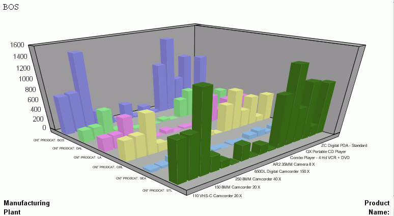
Example: Merging Multiple Graphs
The
following illustrates a graph with two categories (Manufacturing
Plant and Product Name) that have been merged.
Displaying Multiple Graphs in Columns
When you create a graph with a second horizontal category,
multiple graphs are generated. You can display these graphs in columns.
Procedure: How to Display Multiple Graphs in Columns
-
Click the Field selection tab of the
Graph Assistant.
-
Add a field to the Create a separate graph for each
value of this field box.
-
If hidden, click Show graph field options.
-
Select the Display graphs in number of columns option
button. This is the default selection.
-
Select the number of columns to display the graphs. The default
value of 1 displays all of the graphs in one single column, one
underneath the other. Selecting a number greater than 1 places the
graphs in an HTML table, with the number of cells across the table
corresponding to the number of columns specified.
Example: Displaying Multiple Graphs in Columns
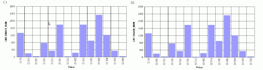
The
following image shows a graph that has a second horizontal category.
The multiple graphs that are generated appear in 2 columns since
the Display graphs in columns option button was selected when creating
the graph.